
Monday, 15 February 2016
Sunday, 14 February 2016
Saturday, 13 February 2016
From my audience's verbal response's it is evident that I have attracted/addressed my audience through the following: colour scheme, mode of address, images, and layout. I kept the colour scheme the same the whole way throughout my magazine as I wanted to create a house style The house style represents the festival, party and club theme of the magazine therefore the audience would be attracted to this. I kept the mode of address simple, easy and fun. As an audience of a younger demographic whole indulge in a party lifestyle they may be less academically able therefore writing long articles that are difficult to understand will not have gained there interest. I kept the language easy and simple to read and I planned the article out to be in interview style so as to be more fun and interesting for a young audience to interact with. The images i used such as the contents page displayed images about my entire magazine. The festival and party pictures reflect the tone of the magazine and I made the images stand out more than the text as an audience of affluent workers are more visually stimulated by content on the magazine than worded. The cover star and the feature article star was a young female of the same age group as the audience therefore they are easily related to the music and fashion she is into. Although she is a female the audience targeted is of both genders because it is about the music and music is not categorised by gender therefore is appealing to male and female. The layout of the magazine is simple, it holds a variety of images and text but is not text heavy, the use of less text and bigger pictures is more appealing to the audience as it invites them in visually as to the experience they will have when reading this magazine. I believe I have attracted/addressed my audience as I have taken into consideration many factors that a young demographic looking at dance and club culture magazines would like through the use of a magazine survey of the demographic and by studying comparative magazines of the same genre. Also, being in the social group of an affluent worker myself I have been able to relate to what people of the same age group as me would like and know the type of visual content that they would like.
Friday, 12 February 2016

Thursday, 11 February 2016
Here I have attached the script of my audio file:
What is a media institution? Well a media institution is an
establishment, often profit based, and is in charge of marketing, distributing
and producing different media products. When initially deciding which media
institution would be best suited to distribute my product I had to look at whether
they were an independent publisher or a conglomerate institution. I also had to
look at whether there was a gap in the
market for my media product to become successful and whether the company has
the correct skills needed to distribute ‘Tempo’ which is categorised in the
genre of ‘dance and club culture’.
Upon research I looked at two competitors of ‘Tempo’
magazine; ‘Mixmag’ and ‘DJ’. Both of these magazines are placed in the same
genre as ‘Tempo’ and draw in the same social demographic. I analysed these two magazines
and how they are distributed throughout the media and the experience that comes
with distributing to a younger demographic and a social group of affluent
workers.
Firstly, I looked at DJ mag, DJ mag is an English magazine
which produces 1 issue of the magazine monthly and is dedicated to electronic
dance music. The magazine is edited by Ben Murphy and was originally an independent
distributer under ‘DJ mag publishing’. However, due to being an independent
company the magazine was very low profile therefore generated a very low
profit. Recently, the magazine has moved over to a larger publishing company
and is now distributed by ‘Thrust publishing’. DJ mag has now become a high profile magazine
and profits have proliferated compared to their old sales as an independent
publisher.
My next competitor goes by the name of ‘Mixmag’. Mixmag is
also a magazine dedicated to dance music and releases one issue each month. The
first Mixmag issue was distributed on the 1ST February 1983, and in 2010 were selling
roughly about 21,250 units per year. Mixmag is published by a publishing
venture set up by David Hepworth and Jerry Perkins called Development Hell LTD.
The company creators of Development Hell LTD have more than 35 years combined
experience devising, editing and publishing titles such as Q, Empire, Mojo and
Heat. This allows Mixmag to reach a wider audience due to being distributed by a
larger publishing company.
However, after researching into both of my competitors distributers,
I wanted a publishing company that would predominantly have the availability to
offer me required skills I need to reach a wider audience than an independent
publisher would.
In contrast to Mixmag and DJ’s distributors I looked at
global conglomerates such as Bauer Media. Bauer Media is one of Europe’s most
successful media companies offering over 300 magazines such as karrang! and mojo.
Bauer Media have a global presence spanning 16 countries on 4 continents, allowing
them to collaborate across borders. Due
to this, there knowledge of specific selling points for the magazine would be
pin pointed and enhanced so as to make the magazine successful in not just 1 or
2 but many different countries across the globe. The end result of this would
mean that a greater amount of profit would be made in contrast to if my magazine
was distributed by a smaller publishing house.
The reasoning for wanting ‘Tempo’ to be published by Bauer Media
is because there is a gap in the market for the genre of ‘Dance and club
culture’ therefore my magazine would have a unique selling point and be able to
reach a new and larger audience of affluent workers. Bauer media work with
technological advancement and cross convergence of my media product would mean
that “Tempo’s” content would be accessible to everywhere to everyone. With the demographic
of tempo being of a younger audience, cross media convergence would be a great
way to promote the product as the generation of ‘Tempo’s’ audience is the most
tech savvy and in touch through the use of web 2.0.
In conclusion, I would want Bauer media to distribute my
media product, due to the large and widely spread audience that can be reached through
the distribution of different countries. The experience the offer would mean
that ‘Tempo’ magazine could reach the high of success and generate a large profit.
Wednesday, 10 February 2016
Sunday, 31 January 2016


Saturday, 30 January 2016
Double Page Spread: Photoshop Tools

 For my double page spread I used many tools to create the page. I used the text box tool to create all of the text on the page including the headline, pull quote and main body of text (the feature article). I used the magnetic lasso tool and polygon lasso tool to allow for precision to be applied when cutting out my feature article photograph. I also used the blur tool on her skin to create an airbrushed look to the photograph. I used the rectangle tool to create the headline boxes, the captions on the pictures, the bottom bar on the page and the 'news column'. I used the opacity tool to change the opacity of certain text boxes to allow for the typography to stand out more against the page. I used the drop shadow tool to emphasis the edges of the headline and the stand first.
Photoshop Design Process: Double Page Spread


I added a pull quote onto the image of the feature article photograph to link it to the main body of the text. I changed the opacity of the text box behind the pull quote to allow the feature article picture to show through. I also added a 'news block' at the top left to fill up some negative space. I also added the date on the top right hand corner. 

Then I added a stand first, because my demographic would not like reading a whole block of text so by introducing a stand first, it allows them to easily be introduced into the interview and appeals to them more to want to read it. I also then added the main interview and started to fit the text around the pull quote.


Finally to get rid of the negative space I added a news block with additional information of what other pages in the magazine have to allow the demographic to easily find more articles. I moved the main body of text around and added another picture to finish my double page spread
Thursday, 21 January 2016
Contents Page: Photoshop Tools


Wednesday, 20 January 2016
Photoshop Design Process: Contents Page


Thursday, 14 January 2016
Front Cover: Photoshop Tools


dimensional look.
Wednesday, 13 January 2016
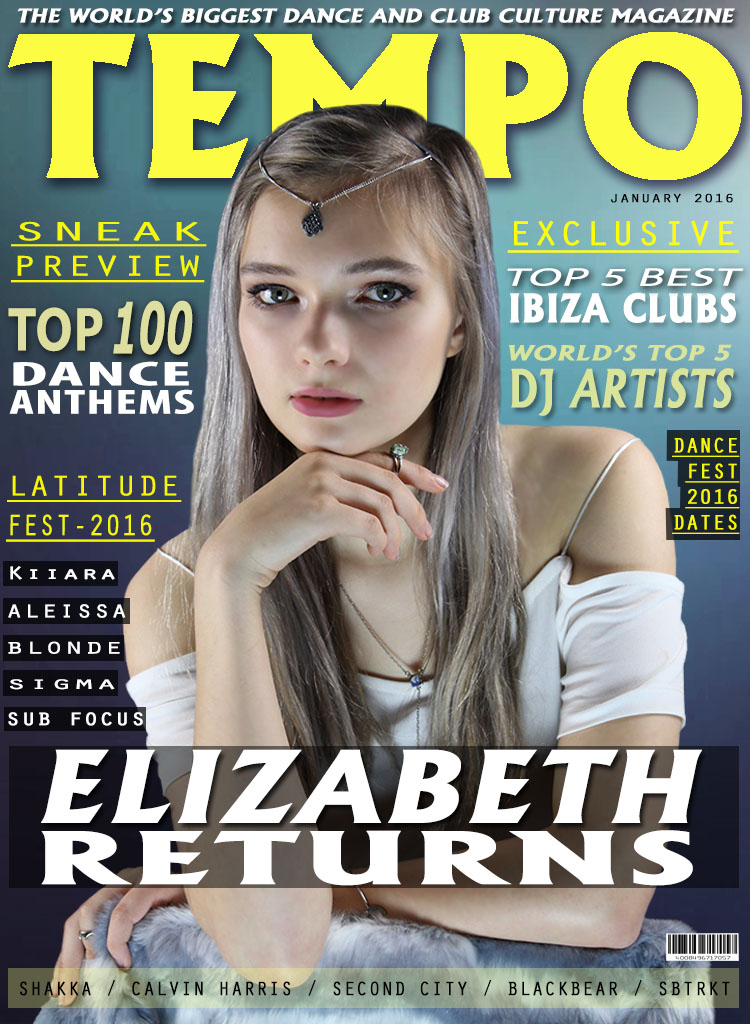
Photoshop Design Process: Front Cover

To create my front cover I started with a gradient background as, when evaluating other magazines of the same genre I found that generally they had a gradient background. This is because it sets the tone of a fun, playful magazine and appeals visually to the demographic.


Tuesday, 12 January 2016


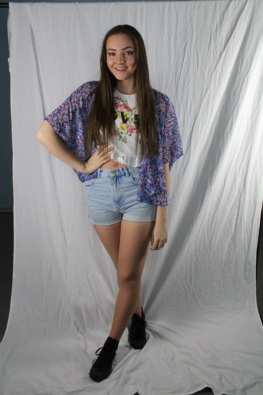
These photographs were taken due to me needing more than one model on my magazine. This second model was needed to enhance the visual diversity in my magazine such as on the contents page. The cover star used on the front cover and the double page spread was the same model there for I needed to vary the people featured in my magazine to make it more realistic.
Monday, 11 January 2016
Front Cover Photography Process: Final Front Cover Photograph

To enable me to vary the different type of photograph I produced I took some, long shots and some mid shots. however I didn't take any close up's because I felt this type of shot would not have looked correct on the magazine and my survey also said that for the front cover photograph a mid shot would look most engaging and appropriate.
When constructing the photograph I wanted my model to engage the reader with the use of eye contact but I didn't want this to seem intimidating so I positioned the model sitting down, leaning over a chair with her chin resting on her right hand. I felt that this set a more casual, relaxed tone to the cover photo.
Front Cover Photography Process: Producing the Correct Shot


To allow the cover photographs to be taking at a high quality for my magazine, I had to experiment with lighting and positioning of my model to review the pictures on the camera and understand which angles and position of lighting made the picture look to a high standard. As the pictures above display, I had the model sitting and standing playing with different eye levels in relation to the camera and the models vision. When reviewing the pictures regarding positing of the model I found that the pictures I took with the model sitting down added a more relaxed tone to the picture through the use of body language which I felt would appeal more to the demographic. The placing of soft box lighting had to be positioned differently accordingly to the models stance. When focusing on taking pictures when the model was sitting I placed one light on the background and one light on the models face slightly to the right to create a shadow on the left side of her face to add dimension to the photograph to avoid the photograph looking two dimensional. As well as the light on the side of the model and on the background I also wanted a light towards the front of the model, below her eye line to create a glow from below on her face.
Subscribe to:
Comments (Atom)