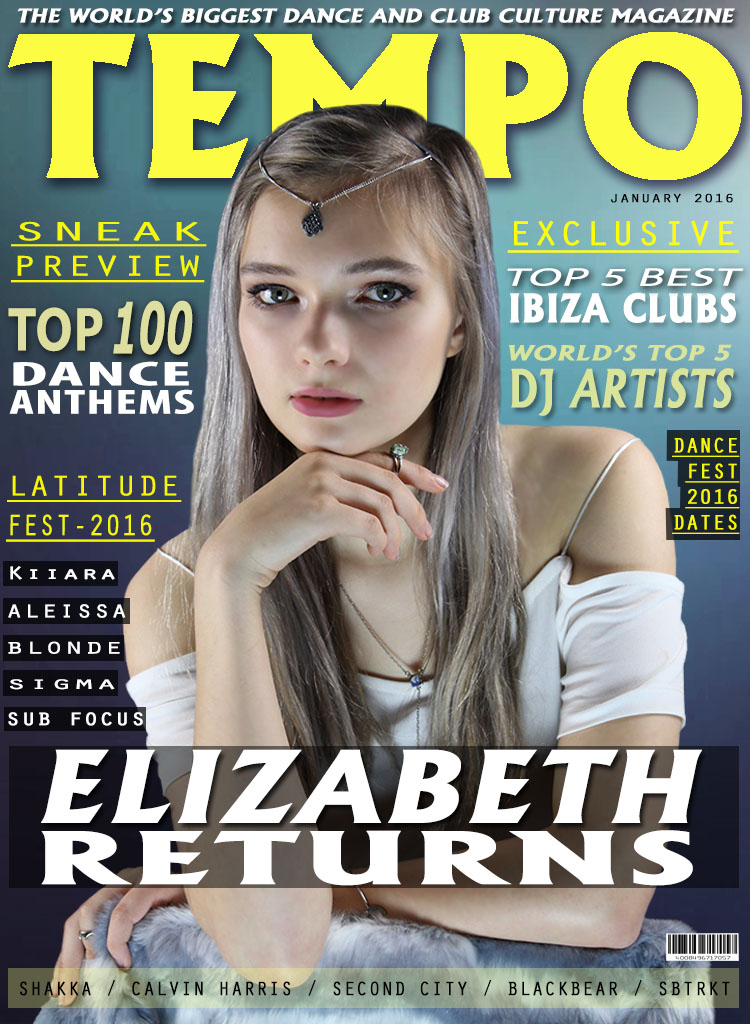
To create my front cover I started with a gradient background as, when evaluating other magazines of the same genre I found that generally they had a gradient background. This is because it sets the tone of a fun, playful magazine and appeals visually to the demographic.

Next I added the masthead ('Tempo') and also the puff above the masthead. I made the masthead, big and bold with the use of a black drop shadow against the yellow text to emphasis the size further. The typography is large as the masthead needs to stand out when the reader initially picks up the magazine. The masthead has connotations of music and rhythm therefore immediately suggesting a dance/music/club culture vibe to the magazine. With the masthead being short, snappy and bold it grabs the readers attention straight away. For the puff the typography is in bold and the same font to convey a sense of order amongst the page and it is significantly smaller than the masthead as it is there to boost the appeal of the magazine.

Next I added the cover photo of the cover star. I cropped around the picture precisely on Photoshop with the polygon lasso tool to allow for a neat and professional look.The cover star is young and stylish; this appeals directly to the demographic as they are in the age range of 16-25. She is dressed in simple clothing yet the accessories add to her look to give her more of a bohemian/festival look. She conveys a neutral expression yet the use of eye contact is not intimidating but friendly. The placement of the photo in the center of the magazine over the masthead shows convention in the front cover. The cover photo is very large as the demographic are more visually aware rather than textual. I also added a bar at the bottom of the page with additional artists who are featured in the magazine and a barcode to add more of a realistic feel to the magazine.

Next I added some plugs which are flushed right. The typography of the plugs are all of different sizes, colour, and fonts. By creating plugs with varied typography it allows for the page to be more interesting and makes certain words stand out rather than all being one, colour size and font.
I then added a cover line and behind the cover line I added a black rectangle, low in opacity, to allow for the cover line to stand out more. I used the same typography on the cover line as I did on the masthead to show a sense of order and convention to the page. With the puff, masthead and cover line all being in the same font it ties the front cover together to be one fished piece.
Finally to complete my front cover I added some plugs flushed left on my magazine with some of them being in rectangular black boxes (low in opacity) to match the cover line. The typography of the text is again in all different fonts, colours and sizes to add more definition to the page a some text is more prominent than others. Lastly I added a date in the top right as a conventional magazine would always shown an issue date.


No comments:
Post a Comment