Saturday, 30 January 2016

Double Page Spread: Photoshop Tools


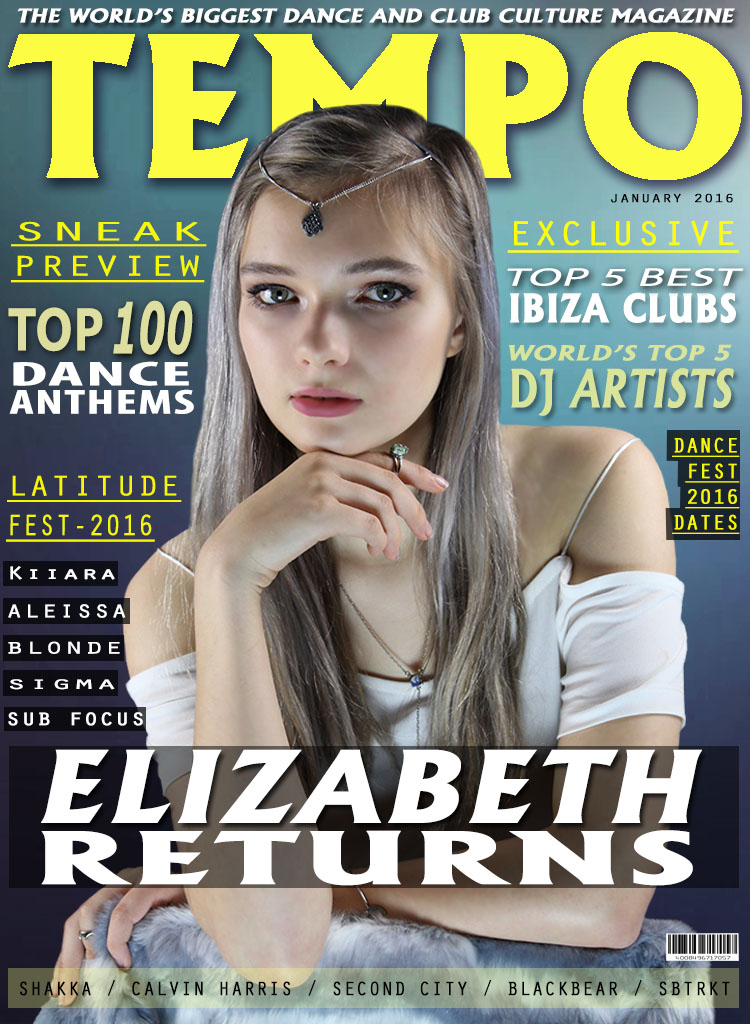
For my double page spread I used many tools to create the page. I used the text box tool to create all of the text on the page including the headline, pull quote and main body of text (the feature article). I used the magnetic lasso tool and polygon lasso tool to allow for precision to be applied when cutting out my feature article photograph. I also used the blur tool on her skin to create an airbrushed look to the photograph. I used the rectangle tool to create the headline boxes, the captions on the pictures, the bottom bar on the page and the 'news column'. I used the opacity tool to change the opacity of certain text boxes to allow for the typography to stand out more against the page. I used the drop shadow tool to emphasis the edges of the headline and the stand first. 

Photoshop Design Process: Double Page Spread

To start my double page spread I used the same background as my front cover and contents page to follow a house style. I  placed the headline at an angle with the text over the text boxes. I used different typography to allow for a variation on the eye when reading the magazine. I also placed a text box using the rectangle tool to create a bar where additional information can be put (such as the web address). 
Next I added the feature article photograph on the left of the page as she is looking left and this shows her focusing on the article/headline its self which makes the readers eyes to also engage in the headline and text as they follow her eye line. The feature article photograph is large as this is conventional in a magazine and also because the demographic are more stimulated by visual images. I also added a smaller picture of the model in a festival environment which is then linked to the text. 
Next I added a page number in the left hand corner in the same typography as the contents page to maintain a house style. I also included some text at the bottom for additional information about the, the website and the captions onto the pictures.   
I added a pull quote onto the image of the feature article photograph to link it to the main body of the text. I changed the opacity of the text box behind the pull quote to allow the feature article picture to show through. I also added a 'news block' at the top left to fill up some negative space. I also added the date on the top right hand corner. 
Then I added a stand first, because my demographic would not like reading a whole block of text so by introducing a stand first, it allows them to easily be introduced into the interview and appeals to them more to want to read it. I also then added the main interview and started to fit the text around the pull quote. 
Further more, I had to realign my text as the main body of text was not central, This meant shifting the picture, main body, the stand first and the headline. To avoid creating unwanted negative space I made the news block longer and shifted everything over. 
Finally to get rid of the negative space I added a news block with additional information of what other pages in the magazine have to allow the demographic to easily find more articles. I moved the main body of text around and added another picture to finish my double page spread 

Thursday, 21 January 2016

Contents Page: Photoshop Tools


For the Contents Page of my magazine I used tools such as the text tool to allow plugs, headings, captions and the title to be made. I also used the text box tool to create boxes around the page numbers, around the heading and around the title. I used the magnetic lasso tool and the polygon lasso tool to crop around multiple images which feature on my contents page. I also used tools such as the blur tool to smooth the appearance of the photographs on my contents page to make them appear refined and professional.  

Wednesday, 20 January 2016

Photoshop Design Process: Contents Page

To start my contents page I Started off with a background and added a black text box with the rectangle tool to create a layer for my title ('contents') to be placed upon in order to make it stand out. I then created another rectangle beneath the contents to hold the date. I made this rectangle yellow so it would fit in with the mise en scene of the magazine as the front cover contained yellow text. This meant that my magazine would follow a house style. I also added the web address at the top of the page to help fill up any negative space. 
Next, I added the page numbers making sure that the numbers went from a range of 0-200 as that is the usual range of a conventional magazine contents page. I also added a page number at the bottom of the contents page as this is a conventional feature of a magazine. 
I continued to add to the contents page by adding sub headings to section off and split up the categories in the magazine. This makes it easier for my demographic to navigate their way around the magazine. Underneath the sub headings I have included a total of 16 article titles in which the reader of the magazine can quickly and easily access and read a snippet of what that specific page includes as i added a short, punchy description of each page. 
To help separate each article title and help keep the text neat and aligned I added small breaks in the page in the form of a line of dots. This simple feature helps the readers eyes to split the 


Thursday, 14 January 2016

Front Cover: Photoshop Tools

For the front cover of my magazine I used tools such as the magnetic and polygon lasso to crop round the photograph to allow it to be precise. On the photograph itself I altered the 'saturation', 'brightness' and 'contrast' to allow the image to stand out against the background. Further more, I included the blur tool onto the picture to smooth out the skin and give a more airbrushed look to the magazine cover.  I used the text box tool and rectangle tool to achieve the plugs on the left and right of my magazine and to also create the cover line, masthead and puff. To enhance the typography on the masthead I used the 'stroke' effect to allow for a slight three
dimensional look.

Wednesday, 13 January 2016

Photoshop Design Process: Front Cover

To create my front cover I started with a gradient background as, when evaluating other magazines of the same genre I found that generally they had a gradient background. This is because it sets the tone of a fun, playful magazine and appeals visually to the demographic
Next I added the masthead ('Tempo') and also the puff above the masthead. I made the masthead, big and bold with the use of a black drop shadow against the yellow text to emphasis the size further. The typography is large as the masthead needs to stand out when the reader initially picks up the magazine. The masthead has connotations of music and rhythm therefore immediately suggesting a dance/music/club culture vibe to the magazine. With the masthead being short, snappy and bold it grabs the readers attention straight away. For the puff the typography is in bold and the same font to convey a sense of order amongst the page and it is significantly smaller than the masthead as it is there to boost the appeal of the magazine.  
Next I added the cover photo of the cover star. I cropped around the picture precisely on Photoshop with the polygon lasso tool to allow for a neat and professional look.The cover star is young and stylish; this appeals directly to the demographic as they are in the age range of 16-25. She is dressed in simple clothing yet the accessories add to her look to give her more of a bohemian/festival look. She conveys a neutral expression yet the use of eye contact is not intimidating but friendly. The placement of the photo in the center of the magazine over the masthead shows convention in the front cover. The cover photo is very large as the demographic are more visually aware rather than textual. I also added a bar at the bottom of the page with additional artists who are featured in the magazine and a barcode to add more of a realistic feel to the magazine.  
Next I added some plugs which are flushed right. The typography of the plugs are all of different sizes, colour, and fonts. By creating plugs with varied typography it allows for the page to be more interesting and makes certain words stand out rather than all being one, colour size and font
I then added a cover line and behind the cover line I added a black rectangle, low in opacity, to allow for the cover line to stand out more. I used the same typography on the cover line as I did on the masthead to show a sense of order and convention to the page. With the puff, masthead and cover line all being in the same font it ties the front cover together to be one fished piece.  
Finally to complete my front cover I added some plugs flushed left on my magazine with some of them being in rectangular black boxes (low in opacity) to match the cover line. The typography of the text is again in all different fonts, colours and sizes to add more definition to the page a some text is more prominent than others. Lastly I added a date in the top right as a conventional magazine would always shown an issue date. 

Tuesday, 12 January 2016

Photogrphy Process: Additional Magazine Photos


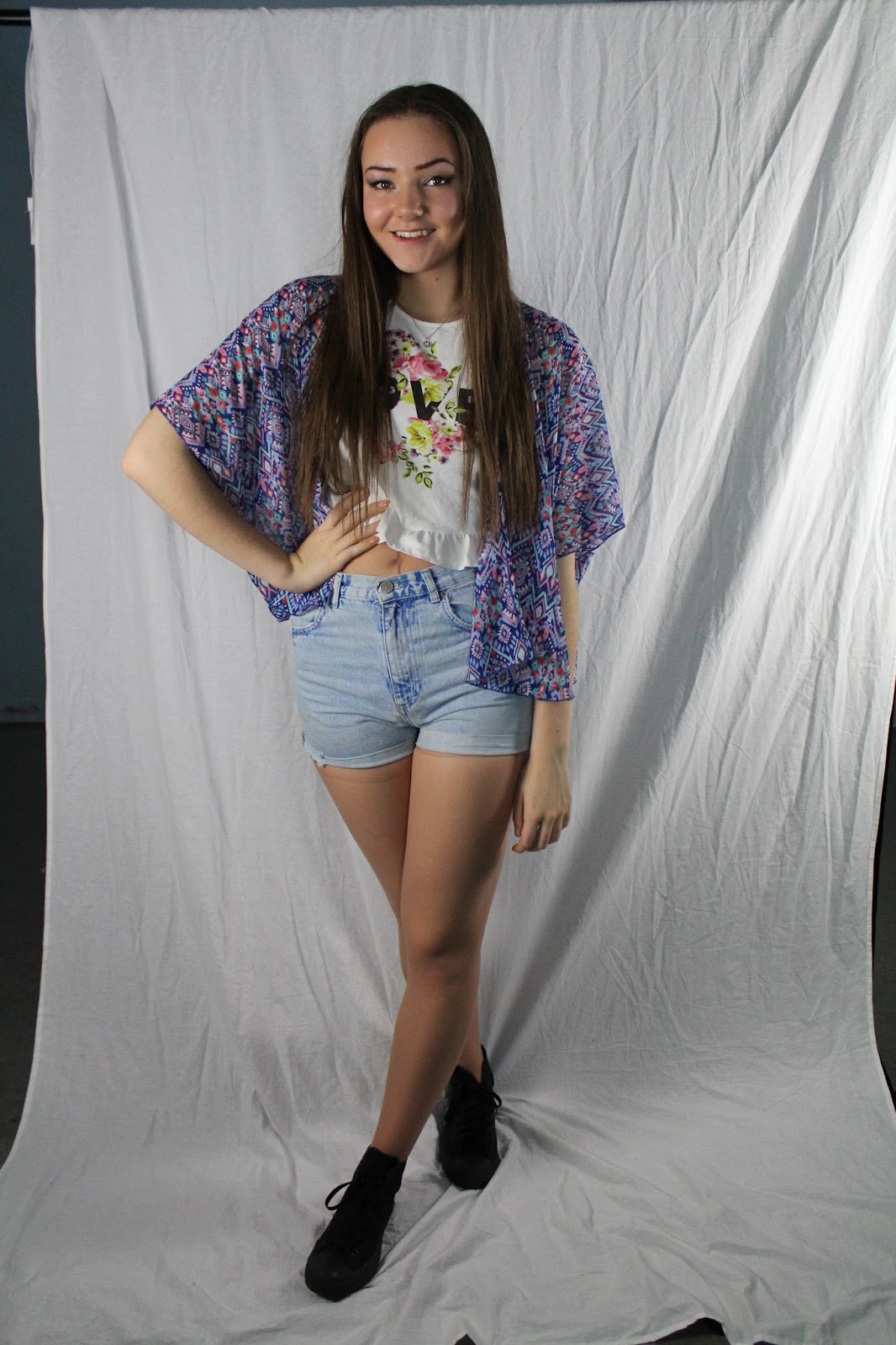
These photographs were taken due to me needing more than one model on my magazine. This second model was needed to enhance the visual diversity in my magazine such as on the contents page. The cover star used on the front cover and the double page spread was the same model there for I needed to vary the people featured in my magazine to make it more realistic.

Monday, 11 January 2016

Front Cover Photography Process: Final Front Cover Photograph


When taking the pictures for my front cover photo I had to consider: lighting, framing, positioning of the model, the models expression and eye contact, and relate the models outfits to the demographic of my magazine. Once I had considered all of these factors, this photograph on the left was the final picture which I decided to place on my front cover because it met all the demands of my specification, my survey and the conventions of a magazine.

To enable me to vary the different type of photograph I produced I took some, long shots and some mid shots. however I didn't take any close up's because I felt this type of shot would not have looked correct on the magazine and my survey also said that for the front cover photograph a mid shot would look most engaging and appropriate.

When constructing the photograph I wanted my model to engage the reader with the use of eye contact but I didn't want this to seem intimidating so I positioned the model sitting down, leaning over a chair with her chin resting on her right hand. I felt that this set a more casual, relaxed tone to the cover photo.

Front Cover Photography Process: Producing the Correct Shot


To allow the cover photographs to be taking at a high quality for my magazine, I had to experiment with lighting and positioning of my model to review the pictures on the camera and understand which angles and position of lighting made the picture look to a high standard. As the pictures above display, I had the model sitting and standing playing with different eye levels in relation to the camera and the models vision. When reviewing the pictures regarding positing of the model I found that the pictures I took with the model sitting down added a more relaxed tone to the picture through the use of body language which I felt would appeal more to the demographic. The placing of soft box lighting had to be positioned differently accordingly to the models stance. When focusing on taking pictures when the model was sitting I placed one light on the background and one light on the models face slightly to the right to create a shadow on the left side of her face to add dimension to the photograph to avoid the photograph looking two dimensional. As well as the light on the side of the model and on the background I also wanted a light towards the front of the model, below her eye line to create a glow from below on her face.