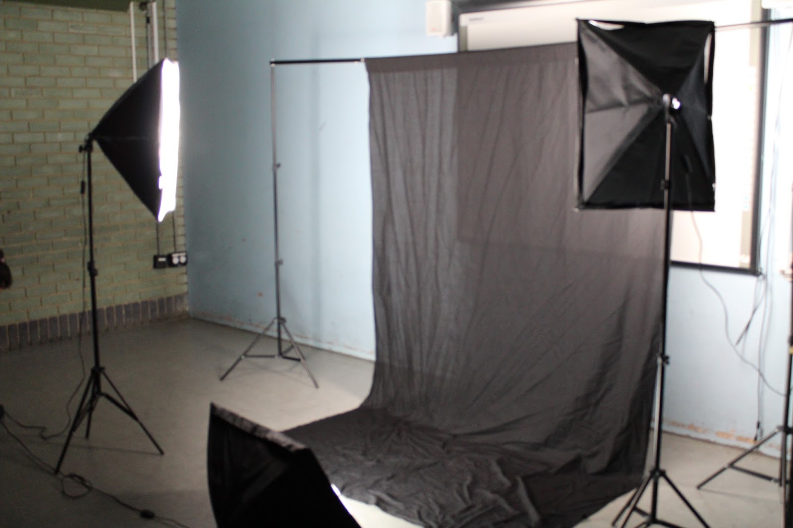
Tuesday, 1 December 2015
Front Cover Photography Process: Taking the pictures
Sunday, 29 November 2015
Front Cover Photography Process: Setting up equipment
Front Cover Photography Process: Styling the cover star
To start my photo shoot process I first had to style my model regarding her makeup and hair style. I did this so that the cover star would look presentable ad to convey the right attitude to relate to the demographic. I did my cover stars makeup and kept it with quite neutral tone and focused more definition on the eyes so to help engage the reader as eye contact is key and holds convention when posing the cover star on the front cover. Her makeup was neat and elegant with emphasis on the eyes and a slight pop of colour on the lips however her hair was left down and had a body of movement to it to convey a more relaxed, fun and free attitude which is what the target audience of a dance magazine can relate to. However the use of the elegant makeup, it does show that the cover star cares about her appearance.
Wednesday, 25 November 2015
Double Page Spread Draft Designs

2
3
For the double page spread I decided to base it on the second draft as I wanted the feature article photograph to be large on one side of the page. I also wanted the stand first to be under the headline as the demographic would easily be able to find out more about the article rather than delving straight into a long article which may not seem appealing to a the demographic.
Contents Page Draft Designs
For the contents page I decided to go with the first draft design because the demographic would not be interested if there was an imbalance of text to picture ratio. However a contents page is an informative page therefore there should be a substantial amount of text. Due to this I based my contents page on this particular draft over the others as the picture to text ratio would suit my demographic.
Front Cover Draft Designs
I decided to base my front cover off of the third draft because I didn't want the front cover to be to crowded in terms of plugs and text. I wanted the masthead, cover line and the cover photograph to be the main focus of the front cover as my demographic are stimulated by visuals rather than through text.
Tuesday, 24 November 2015
Monday, 23 November 2015
Style Board Inspiration
To enable my magazine front cover to conform to what the demographic would find most appealing, the cover star has to engage with the target audience. As inspiration for my cover star, these images of current young models and singers would be appropriate take into consideration aspects of their actions, poses, facial expressions and body language to convey the correct tone for my magazine. My cover star will be dressed in clothing appropriate to the dance magazine, either on trend fashion pieces as the demographic are into young trendy experimental fashion or festival looks as these are common events that the target audience would attend.
Tuesday, 17 November 2015
Monday, 16 November 2015
Audience Profile
The demographic of the magazine are in the age range of 16-25, mainly young people who are attracted to the night life and the clubbing scene attending the latest events to make the most of the nights ahead of them as young adults.
- A typical reader of the magazine would be a young female/male at the age of around 16-25.
- They are most likely to have a low income job or perhaps in education (college/university). Even if they do have a low income their money is usually spent on things such as concert tickets or entry to the latest clubbing events.
- They tend to be bold, outgoing and fun, experimenting with new music and fashion trends.
- The reader is very relaxed about life, lives for the moment to have fun and enjoy socialising with friends and listening to good music.
- Their hobbies would include partying, socialising, listening to music, hanging out with friends at their local clubs, bars or party's, keeping up to date with trendy DJ's, events and downloading new music.
- They would also typically have a strong interest in the music festival scene and like to be up to date with the latest trends.
Wednesday, 11 November 2015
Magazine: Design Brief
For my dance music magazine, based on the results from my survey I will be including:
- A colour scheme of red, white and black
- The typography will be based upon a 'fun and playful' tone.
- The magazines content will be informative and busy
- The cover star will be female
- The feature article photograph will be taken at a mid shot
- The image to text ratio will be 50:50 to create a balance
- The double page spread will be mainly in interview style
- There will be three or more pictures featured on the double page spread
- The overall magazine should convey a relaxed tone to the reader.
Tuesday, 10 November 2015
Magazine Survey Results Evaluation
By carrying out a survey on my demographic of the ages between 16-25 about what type of magazine features would be important and what would appeal to them the most, enables me to analyse this data and base my magazine on what the target audience would feel more engaged with regarding a front cover, contents page and double page spread.
- For the typography that i will use on the masthead the demographic chose between 'sharp and edgy' or 'fun and playful'. Their response was 60% preferred fun and playful which is what i feel does meet the right tone for the masthead of a dance magazine as its has more of a relaxed and joyful tone to the magazine.
- The cover star on the front of my magazine will be a female and it will be a mid shot as the percentage on these questions were around 60-70% for this These are both what the demographic said would appeal to them if they were to buy a dance magazine. The mid shot will be able to convey the attitude of the cover star and even though it will be a female on the front it doses not restrict the magazine to a female audience as a dance music magazine will appeal to both.
- The demographic when collecting results from my survey have said that they would be more interested in a magazine that is busy and informative and they are passionate about the music that they listen to and would much prefer for there to be a sufficient amount of witting for them to read.
- With regards to the colour scheme the survey result showed that the demographic would prefer a more conventional colour scheme of the purple, white and black.
- The image to text ratio that the demographic would prefer to see on the magazine's contents page was 80% wanting a 50:50 ratio. This is a good balance to have on the contents page as the reader can clearly look at both picture and text to easily navigate their way around the magazine.
- The content that would appeal to the demographic with regards to a double page spread would be an interview rather than an informative article. This reflects their attitude of have a more relaxed magazine which displays information but is more of a chatty tone.
- The tone which the demographic would prefer is a relaxed tone which is also why they would prefer the interview style rather than the informative style of article on the double page spread.
- The demographic would also prefer 3 or more pictures on the double page spread to break up the volume of text over the two pages.
Overall the demographic would prefer a more relaxed, informal and chatty feel to the magazine but with both a relatively balanced picture to text ratio on all aspects of the magazine whether it be a front cover, contents page or double page spread.
Friday, 6 November 2015
Magazine Evaluation: Summary
Mixmag Magazine:
The magazine Mixmag as a whole is a very simplistic magazine
with a lot of negative space to enhance the simplistic tone. Mixmag is
presented this way because the demographic find it easier to relate to a
magazine with limited text as they are of a younger age who do not convey an
interest in long written articles but are stimulated more by visual images.
Mixmag aims it at the target audience by containing lots of fun bright and bold
visual images of festivals, music scene and parting scenes. These are the type
of images that engage the reader and get them to want to buy the magazine
because they can then relate to the context in the magazine whether it be
visual or written.
This is a strong aspect that helps the young demographic
relate to the magazine. This would be a good point for my magazine as strong
images are eye catching and allow the reader to find a lot of interest in the
magazine. However i would not want my magazine to be simplistic like mixmag as
the exaggeration of the negative space does not grab the readers attention
which would negatively impact the mise en scene of the front cover of the
magazine.
Mixmag's front cover, contents and double page spread do not
all follow the same house style. In my final magazine i would like the magazine
to follow the same house style as then it gives there a sense of structure and
a more sophisticated feel to the magazine.
The contents is very unconventional without the use of the
more than two columns and the use of a very large picture spread across two
pages. I would not like my contents page to follow the same style as mixmag due
to the use of these very unconventional features.
The double page spread is also very unconventional as there
is minimum text on the page and the picture is the main focus of the article.
However there are some features that I would use on my magazine such as the
stand first and the bold headline which make it easier for the reader the gage
what the article is about and these are seen to be conventional features used
on magazines.
DJ Magazine:
DJ mag has a busy layout unlike mixmag which could be due to the demographic being slightly more sophisticated in their reading style and would read longer articles. However the double page spread was layed out closer to the style of mixmag with a large feature article and less text yet it is very approachable in terms of gender. This is how i would like my magazine to be layed out and be able for both genders to be able to enjoy the magazine. This magazine is more conventional as it uses plugs, pull quotes and a lede to enhance the readers understanding of the magazine and the context that is layed out in the magazine.
DJ's contents page is very conventional in the way it layed out and this is how I would like my contents to be portrayed in my magazine. DJ uses columns to separate page titles which have been ordered further by categorising them into subtitles. This makes it a lot easier for the audience to navigate around the magazine and can enjoy the magazine more by finding the specific pages that interest them.
I want the contents page to be as informative as possible and i think DJ mag contains a good picture to text ratio that convey the right tone of the magazine.
Q Magazine:
Q magazine is a much more sophisticated magazine with the use of plugs, large headlines, stand first and pull quotes used through out the magazine which enhances the idea of really grabbing the readers attention, This is something that I would like to be able to capture in my own magazine as i feel it shows structure and can be aimed at a more sophisticated audience. I also think that the double page spread would be good influence on my magazine as it was set out in a more conventional way with the use of 5 to 6 columns with a large picture in the middle. I like this spread because it shows that the reader is interested in reading it but their is also a good ratio of visual images as well as written. The images compliments the text when there is a lot of text as it gives the reader something else to focus on as well as the written text.
Monday, 2 November 2015
Friday, 30 October 2015
Wednesday, 21 October 2015
Magazine Evaluation - Mixmag: Double Page Spread.
The Double page spread is about a DJ Artist called 'Helena Hauff'. She was featured on one of the plugs on the front cover of the magazine so she is a well known artist to the demographic as they are interested in her type of music. The magazine double page spread is unconventional in the way it is layed out because it goes over three pages rather than two, this is mainly due to the picture taking up whole page in the article.
The picture is a very large image which spreads across the left page and slightly onto the right page, this again is placed like this because although the picture isn't a bright and bold as others in the magazine the readers are still more into looking at visual images therefore by taking up most of the space with an image the reader is more likely to read the article as the text looks minimal.
There is a stand first on the magazine displayed over the picture. This gives the reader an insight into the magazine and what the article is about. A short stand first like this in this type of magazine is important as the demographic can be quickly introduced to the article rather than skipping over the article due to a lot of writing. Also the title of the article 'all that she wants' doesn't suggest much about the article its self so the stand first really boosts the article and draws the reader in.
The way the text of the article is layed out is seen to be conventional as it is in columns however there are only two columns and a lot of negative space around it so in that sense the magazine is unconventional. The negative space is used in this magazine because it makes the article look neat, easy too read because this is very much how the demographic prefer the magazines to be layed out.
Tuesday, 20 October 2015
Magazine Evaluation - Mixmag: Contents
Mixmag's contents page is layed out on a double page spread on the fourth and fifth page in the magazine. The magazine follows the same style of the front cover such as small typography with the use of bold titles but it also contains two large pictures in the center of the double page spread and two smaller pictures on the page to the right. By the overall look of the contents page it looks to be conventional with the layout, it is neat and very clear to read but it is on a double page spread not on a single page like a usual magazine.
The main focus when you first look at the contents page would be the large pictures, the denotative of this picture is a young in a festival scene surrounded by and another picture featuring a huge party scene at a large festival with bright colours, fireworks and crowds of people. These pictures are both related to the party and the festival/clubbing vibe of the magazine which emphasizes the demographic and what they would enjoy in terms of reading the magazine. The two smaller pictures on the contents page are the feature articles about specific artists that have been featured in the magazine such as 'Helena Hauff'. The two feature article photos are smaller in size than the two festival pictures because the target audience are stimulated by looking at visual images that are related to the party side of the music magazine rather than the long artists features. The larger images are captioned 'Directory' and 'Tomorrowland'. The Directory Page is where the reader can find 'hundreds of the most up-front and exciting clubs in Britain and Ireland'. The other page is a festival scene of 'Tomorrowland'. Tomorrowland is one of the biggest festivals in the world taking place in many different countries across the globe so straight away from looking at visual images on the contents and small captions the reader immediately is drawn into wanting to look further into the magazine for more of the information.
The factual information written on the contents page is layed out in two columns, one which is flush left on the left page of the double page contents and the other column is flush right on the right side of the double page contents. As the writing is placed into columns the magazine does shown some form of convention however the layout as a whole is not a typical conventional way a contents page would be layed out. This reflects the magazines demographic as they are not conventional readers, they prefer the visual content rather than articles which feature long written pieces.
The page numbers are very large on the magazine which make it extremely easy for the reader to navigate around the magazine with out having to flick through numerous pages which may not hold their interest as much as the pages that they are specifically looking for. The title 'contents' on the page is fairly large so its easy for the reader to know what the function of this page is but the physical typography of the word 'contents' does not follow the house style of the magazine regarding how the typography of the fonts on the front cover are. The Magazine also offers 'free tracks from Loco Dice' (the cover Star). By placing this on the contents page it makes more people interested in wanting to buy the magazine as its related to the cover star and its something extra that the reader will gain from buying this magazine.
Monday, 19 October 2015
Magazine Evaluation - Mixmag: Front Cover
Title: “mixmag”
The title of the magazine is “mixmag”, the word “mix” has
connotations of music with reference to mix-tapes and club or DJ music. The
reader, by looking at the title, would have some knowledge that the magazine is
music related, more so aimed at young people. The word “mag” is short and quick
to read. Also with the alliteration of “M” of “mixmag” shows a fast past, sharp
and snappy read which reflects the lives and attitudes of the demographic,
showing that they’re fast pace in the way they live as they are highly involved
in the partying and clubbing scene.
Masthead:
The masthead evokes a sense of a young more playful tone to the
magazine with its bright bold lettering and the purple font. The colours are
not typical colours that would be associated with journalism such as red, black
and white and this supports the idea of the magazine being for a less
sophisticated audience who are not particularly interested in long article
pieces but more visual content. The font is very simplistic, playful and easy
to read and also has a relaxed feel to the lettering. This relates to the
demographic who would approach life in a more carefree and fun way, who are
very much involved in the clubbing scene.
Feature Article Photograph:
The denotative features of the feature article photograph show a young male with his
hands covering a small part of his face showing only his eyes, he has messy
brown hair and is wearing a white long sleeved t-shirt with a zip down the
middle. From this information we can understand the connotations of this
photograph and why/how it was taken. This photo is a posed photo but is made to
look quite causal suggesting the relaxed pose. Even though there is a male on
the front of the cover we know that this magazine is not based only to a male target audience but both genders because of the background being quite a neutral tone
of a light blue but has a bright purple masthead, showing that just because of
a male figure of the front doesn't suggest the magazine cannot apply to both
genders. His hair looks very messy but has been styled to give of the illusion
of a carefree fun and playful vibe to the magazine. The cover star is “loco
Dice” the cover line suggest it’s “the return” of Loco Dice implying that he is
a well know music Artist or DJ due to the magazine being a “dance music and
club culture” magazine. The cover star would usually represent the demographic who read this magazine so the way he looks very relaxed and carefree is
relatable to the audience of the magazines demographic who would read this
magazine and can relate to the cover star. The photograph is taken at a
mid-shot so his face and hands are visible. The idea of the cover star holding
his hands up over his face suggests a more mysterious feel to the magazine,
however there is direct eye contact which engages the audience with the cover
star and allows them to feel a sense of being invited into the magazine to take
a look at all the content inside. His clothing is very plain and not extravagant
nor flamboyant in anyway which again evokes a sense of a relaxed carefree
attitude to the magazine. Although he takes care of his appearance its nothing
that would suggest anything more than that the audience is looking for a fun
time and is more interested in the music than actually the appearance of the
artists.
Puff:
The puff states that mixmag is “the world’s biggest dance music
and club culture magazine”.The puff is used to boost the magazines status.
Therefore mixmag saying that it’s the “world’s biggest” dance magazine entices
the reader in with the use of hyperbole as younger people want to feel more
involved in social events and the latest trends so the target audience believes
that this magazine is a must have buy so they can be up to date with the
“biggest” music trends and events. It doesn’t only say that it’s the biggest
“music” magazine but also the biggest “club culture” magazine which expands the
demographic due to more people in the target audience being interested in the clubbing vibe of the
magazine and less about articles from the artists feature in the magazine.
Cover Lines and plugs:
The cover lines and the plug are very bold with the use of the
striking purple and black font against the pale background of the magazine. The
cover lines and plug both look professional with the use of the main points
being underlined which draws the readers eye straight to key information which
tells them what is contained within this particular magazine. Although the
typography is a small in size it is still underlined and in bold to show
significance and importance on the magazine. This is quite unconventional in
the way it is set out on the magazine which suggests that the reader is
unconventional and doesn’t care for much of a written style of magazine because they engage more thorough visual images on the magazine. However
even though the cover lines/plugs may be unconventional they still convey the
main points and features that are in the magazine so the reader would
immediately know the type of content inside the magazine. The language used in
the magazine is very simplistic “Ibiza Dancers: Lots of them”. This shows that
the language is straight to the point and an easy read and it’s very
unsophisticated. The language of the magazine reflects the demographic who are
more interested in the visual images and not long articles.
Lighting and Portrait Photography Workshop
These are photographs of myself to show me practicing my skills whilst working with the soft box lighting the photography equipment (cameras, backgrounds and props). All the photos shots on these previous few posts have been taken by me working with the models as seen below.
Lighting and Portrait Photography Workshop

This photo was taken at a mid shot, lit with soft box lighting from the right side of the models face and I used a fan to create the movement of the hair. This gave the model a more glamorous, effortless and elegant look. However even though I was
happy with shot of the photograph I did crop out the elbows slightly which is a framing issue and the lighting is too bright.


A mid shot; the softbox lighting has been placed to the right of the model and slightly below to model. The shot was successful in terms of framing as the model is central to the photo graph and all of her hair is in shot. This allowed for the full effect of the dynamic movement of her head to been displayed in the photo. However, again
like previous photos I have over lit the shot and the

Lighting and Portrait Photography Workshop
This shot was done by looking at a
professional photograph, seen on the right
which was featured in a 'vogue Japan'
magazine. I tired to focus on the position
of the models, the facial expressions
and the lighting of the photograph.
professional photograph, seen on the right
which was featured in a 'vogue Japan'
magazine. I tired to focus on the position
of the models, the facial expressions
and the lighting of the photograph.
The lighting was not over exposed on this photo
which meant i didn't need to make any correctional
improvement on photo shop.
This Photo is very well lit using professional
equipment such as soft box lighting. It is lit from
the front, central to their faces allowing for a softer look to the photo. There are no harsh shadows produced in this photo convey a softer tone and their facial expressions are neutral.
Subscribe to:
Posts (Atom)