Tuesday, 1 December 2015

Front Cover Photography Process: Taking the pictures


The results of my survey which was answered by my demographic was that a mid shot for front cover would be most appropriate and would suit the magazine style of  a dance music magazine. Out of the multiple pictures I took, these photos above, I felt were ones of a high standard and would look best in my magazine as they give of the correct impression of a fun, playful tone which is what I intended to convey to the demographic of a dance music magazine. Some of these pictures are long shots rather than mid shots and these would be more appropriate to put on my contents page or double page spread. I styled her in different outfits so as to get as to have more options when choosing my cover photos and to incorporate an element of variety in my magazine with regards to the style of my model. I also used props such as headphones to enhance the fact that these pictures are to be in a dance music magazine. The lighting in these photographs varied depending on the stance of the model and the position of the camera, whether it was a long shot, mid shot or close up.

Sunday, 29 November 2015

Front Cover Photography Process: Setting up equipment


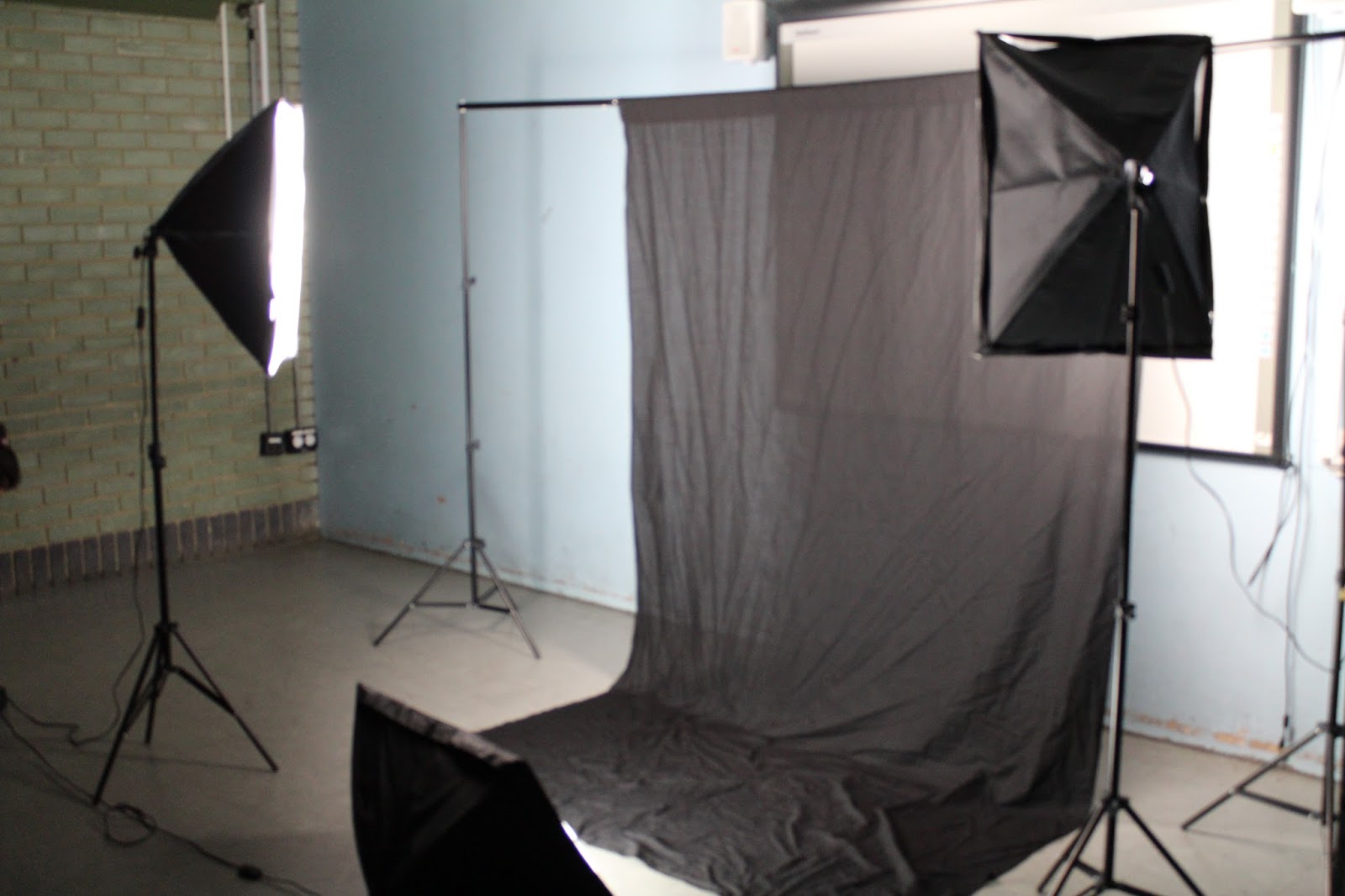
After styling the cover star, I set up the soft-box lighting equipment, the black/white screen (depending on the outfit that my cover star would be wearing in the shot), a tripod to place the camera on, and the camera was set in position. I placed the lights, one shining on the background, one in the foreground to shine over the models face and one on the ground. I experimented with different angles, and positioning of the lighting and by turning different lights on and off depending on how the lighting looked when the cover star was in front of the lights.  


Front Cover Photography Process: Styling the cover star


To start my photo shoot process I first had to style my model regarding her makeup and hair style. I did this so that the cover star would look presentable ad to convey the right attitude to relate to the demographic. I did my cover stars makeup and kept it with quite neutral tone and focused more definition on the eyes so to help engage the reader as eye contact is key and holds convention when posing the cover star on the front cover. Her makeup was neat and elegant with emphasis on the eyes and a slight pop of colour on the lips however her hair was left down and had a body of movement to it to convey a more relaxed, fun and free attitude which is what the target audience of a dance magazine can relate to. However the use of the elegant makeup, it does show that the cover star cares about her appearance. 


Wednesday, 25 November 2015

Double Page Spread Draft Designs

1

2
3
For the double page spread I decided to base it on the second draft as I wanted the feature article photograph to be large on one side of the page. I also wanted the stand first to be under the headline as the demographic would easily be able to find out more about the article rather than delving straight into a long article which may not seem appealing to a the demographic.

Contents Page Draft Designs

1

2

3
For the contents page I decided to go with the first draft design because the demographic would not be interested if there was an imbalance of text to picture ratio. However a contents page is an informative page therefore there should be a substantial amount of text. Due to this I based my contents page on this particular draft over the others as the picture to text ratio would suit my demographic. 

Front Cover Draft Designs

1

2

3
I decided to base my front cover off of the third draft because I didn't want the front cover to be to crowded in terms of plugs and text. I wanted the masthead, cover line and the cover photograph to be the main focus of the front cover as my demographic are stimulated by visuals rather than through text.